Design System
Building a scalable foundation for digital products
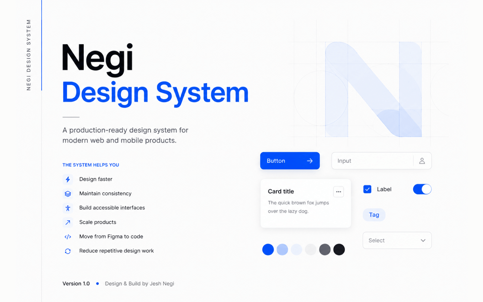
A structured design system — foundations, tokens and a scalable architecture — built to remove repeated decisions and keep future product work consistent by default.
Role
Product & Design Systems
Year
2025
Platform
Web & Mobile
The Problem
As products grow, small inconsistencies in colour, type, spacing and interaction patterns compound — every new screen makes a fresh decision that a previous screen already made differently, with nothing forcing consistency by default.
What I did for Design System
I built the foundational layer of this design system solo — colour, typography and spacing, plus the primitive-to-semantic token layer that components will reference — documented and applied to a real interface end to end. Foundations came before components deliberately: building components before the token layer existed would mean rebuilding them the moment the tokens changed underneath.
The Outcome
A working foundation, not a finished product — real colour, typography and spacing tokens, documented and applied to at least one real interface, with the component layer deliberately not yet built. No adoption numbers are claimed, since nothing has been handed to another team to use yet.
3
Foundations built
6
Semantic token groups
Next
Component library
Foundations, in Figma
 Overview
 Colour
 Typography
 Spacing
Have a similar project in mind?
Let's talk about what you're building and how I can help you ship it.